People powered OS
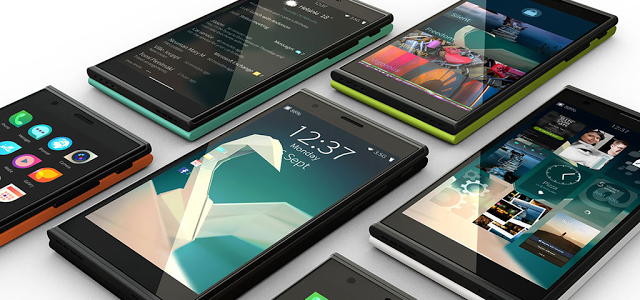
Sailfish OS has always been a people powered platform. While maturing to Sailfish OS 2.0 Jolla has listened closely to user feedback through customer polls and together.jolla.com, and worked together with the community to build the best user experience possible. The key objectives for this update are to ease and simplify the first time experience and to improve the overall quality and flow of the OS.
Enhancing the flow with a new carousel view
The most notable change is the new and refreshed Sailfish OS 2.0 user interface, which introduces a new and simple mental model of core views, enhancing the flow of the OS dramatically.
Navigation works simply by swiping left or right between Home and Events, like in a carousel. The App Grid is quickly accessible from anywhere in the UI just by swiping over the bottom edge – a user doesn’t need to go to the Home to open a new app.
Events tool is now richer and smarter by comprising a weather widget with an option to display five-day weather forecast, a calendar widget, as well as grouped and enhanced notification handling. Users can now see and do more with notifications directly in Events, whether they are from native apps or Android apps.
Additional enhancements include e.g. redesigned App covers for Gallery, Notes, and Camera apps, many new animations, and improvements for existing apps like Jolla Store, Calendar, and Camera. Just to mention a few.


